Network & Security Overview Dashboard — UX Case Study

1. Introduction

The Network & Security Overview Dashboard serves as the primary landing page after login, providing a unified snapshot of an organization’s network and security posture.
It delivers a high-level summary of connectivity health, performance, and protection status — helping Network Admins, Security Admins, and Executives monitor operations and evaluate how the system is safeguarding their environment from threats.

My Role

Responsible for end-to-end UX design:

  • Conducted user research and stakeholder interviews
  • Defined information architecture and task flows
  • Created low- to high-fidelity wireframes
  • Built interactive prototypes in Figma
  • Maintained alignment with the Design System for consistency and scalability
  • Collaborated closely with Product, Engineering, and Security teams throughout the design and validation phases.
  • Providing support during the development phase to ensure the design was implemented as intended.

2. Background

Context and Business Goals

The dashboard consolidates network performance and security intelligence into a single, intuitive interface.
It enables IT and security teams to track service health, performance metrics, and blocked threats — all from one view.

Business Goals

  • Provide clear visibility of key metrics across roles

  • Reduce navigation complexity by centralizing summary data

  • Reinforce value by visualizing real-time protection and uptime trends

3. Problem Statement

Challenges

  • The existing overview displayed dense technical data without hierarchy

  • Security and network metrics were mixed, reducing clarity

  • Executives found it difficult to extract high-level insights

  • Users needed multiple clicks to reach actionable pages

Objectives

  • Create an at-a-glance experience with intuitive grouping and visual hierarchy

  • Introduce visual storytelling through metrics, charts, and summaries

  • Distinguish Network and Security perspectives clearly

  • Support role-based relevance to serve both operational and executive users

4. Research

Stakeholder Interviews

Insights gathered from product and support teams revealed:

  • Network admins monitor uptime and site status daily

  • Security admins review blocked threats and anomalies regularly

  • Executives seek a performance summary showing overall efficiency and ROI

User Research

Interviews with real users uncovered:

  • They preferred quick status visibility after login

  • Trends and visual cues were more helpful than numeric tables

  • Many wanted role-based customization for their dashboards

Competitive Analysis

Benchmarked dashboards from industry leaders in network visibility and SASE solutions.
Key learnings:

  • Summary cards with icons and color cues improve scanning

  • Trend charts communicate change better than static numbers

  • Simplified grouping enhances usability and comprehension

Personas

Persona Role Goals Pain Points
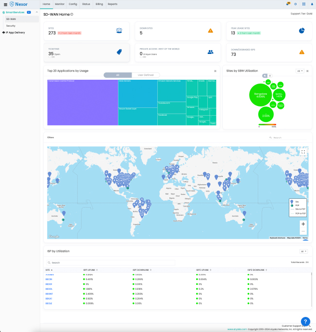
Alex — Network Admin Manages global infrastructure Ensure uptime, monitor site connectivity Difficult to quickly identify problem sites
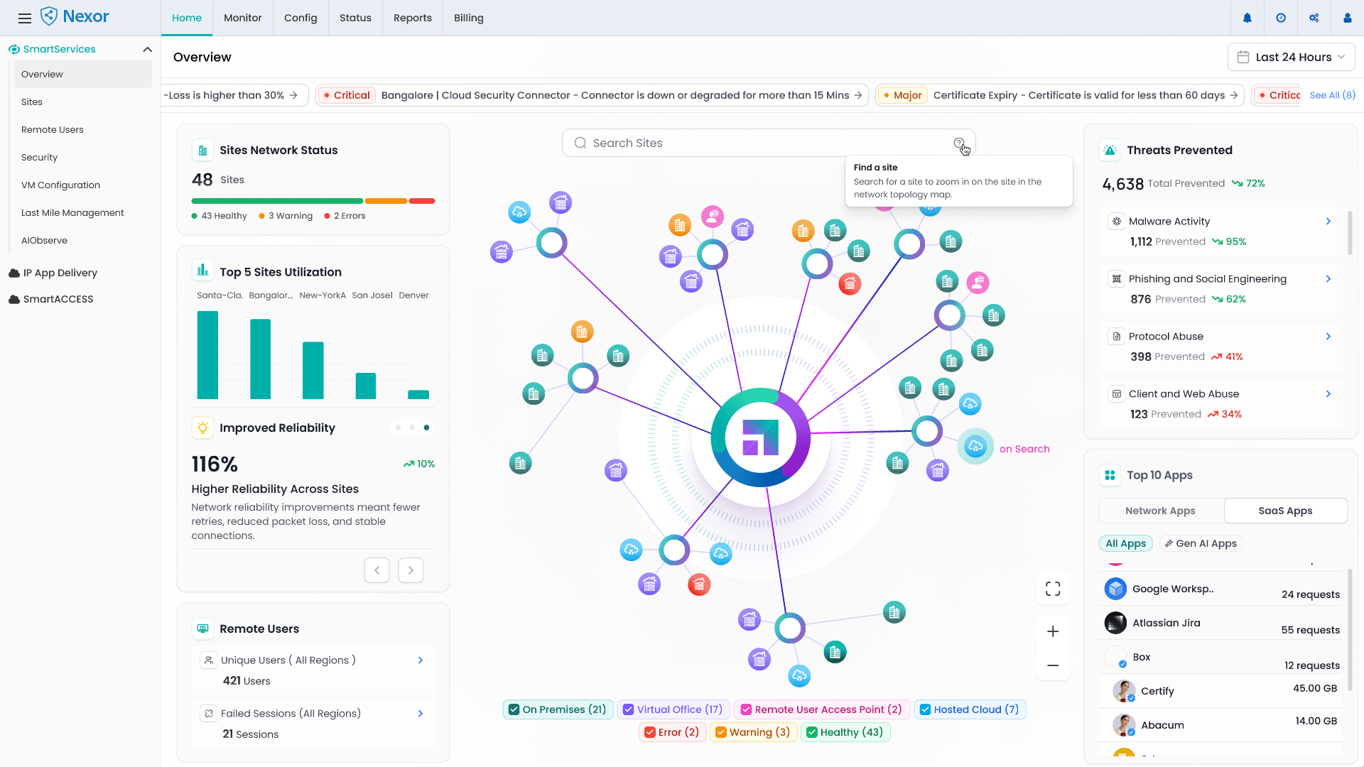
Priya — Security Admin Oversees threat protection Track attacks, monitor security health Unable to correlate threats with network impact
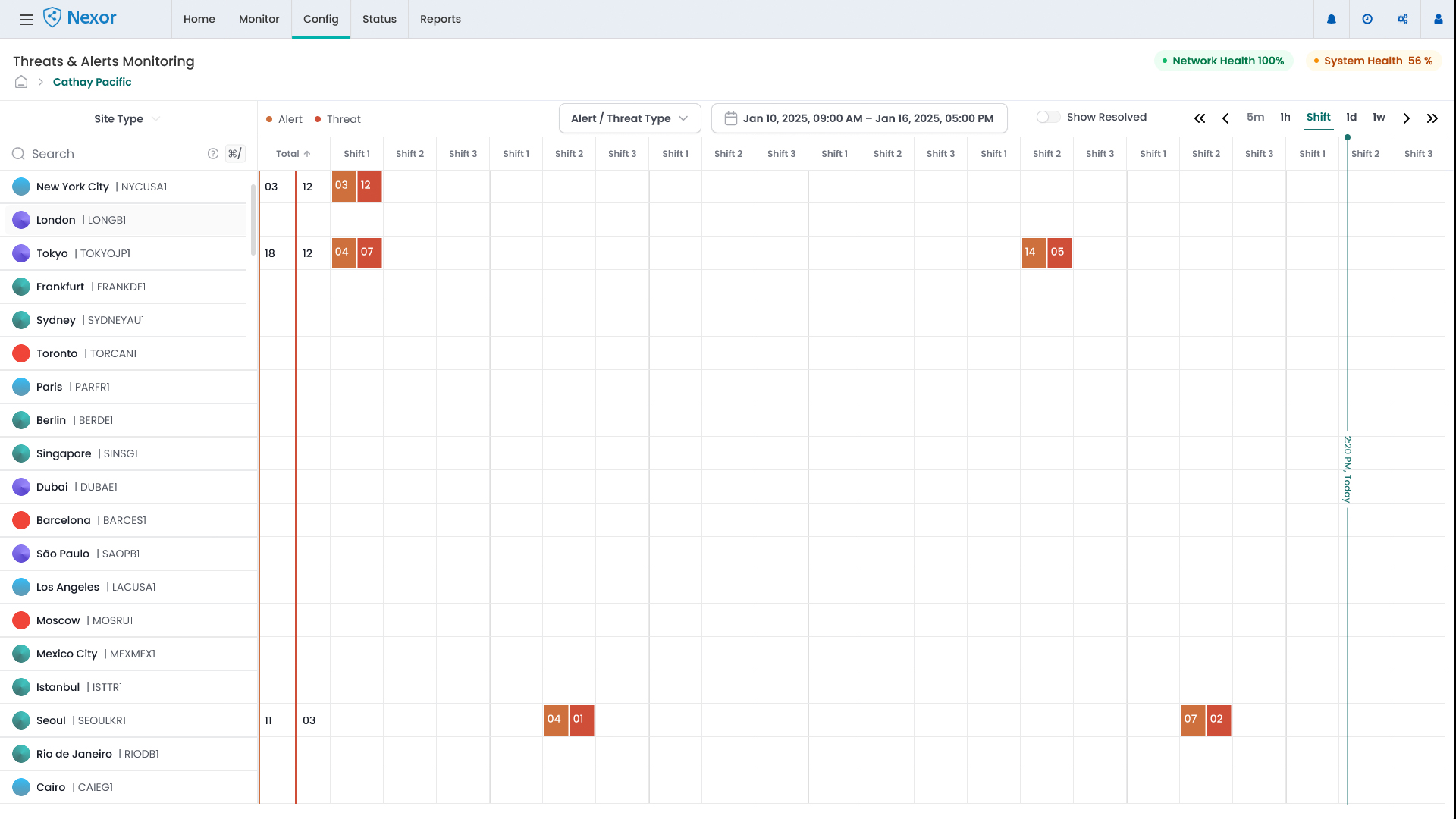
David — Executive / CIO Oversees performance & ROI View summary of network and protection status Overwhelmed by technical data; wants concise insights

5. Define

User Tasks

  • View network and security health instantly after login

  • Monitor uptime, latency, and blocked threats

  • Identify critical issues or sites with performance degradation

  • Apply filters (region, time period, site type)

  • Export visual reports for management or audit use

Task Flow

Login → Overview Dashboard → Select Filter → View Key Metrics (Network + Security) → Drill Down → Take Action (Open Report / Site Details / Security Logs)

User Flow

  • Network Admin: Monitors connectivity, uptime, and site health

  • Security Admin: Focuses on threats, anomalies, and blocked attacks

  • Executive: Views aggregated performance and protection summary

Information Architecture

Home
├── Overview (Landing Page)
│ ├── Network Health
│ ├── Security Insights
│ ├── Usage Trends
│ ├── Site Summary
│ └── Reports Shortcut
├── Monitor
├── Config
├── Status
├── Billing
└── Reports

6. Ideation

Brainstorming Solutions

Explored multiple layout patterns and visual metaphors:

  • Card-based structure with role-specific grouping

  • Dynamic trend charts for bandwidth, latency, and threats

  • Color-coded health states for fast scanning

  • Hover tooltips for contextual insights

  • Filter and time-range controls for customization

Low-Fidelity Wireframes

Sketched variations emphasizing:

  • A summary row of top metrics (Sites, Uptime, Threats Blocked)

  • Mid-section for performance and security trends

  • Bottom zone for geolocation map and user activity overview

Integration with Design Process

Applied existing design tokens, typography, and component standards to maintain consistency and ensure scalability across other modules.

7. Design

Before (Existing Dashboard)

  • The home page currently displays minimal information despite having access to extensive data.
  • Only a few key performance indicators (KPIs) are shown.
  • Both the business team and customers have expressed dissatisfaction.
  • Complaints have been raised about the limited and non-clickable information presented on the home page.
  • Displayed raw data without visual hierarchy.
  • Did not differentiate between network and security metrics.
  • Limited contextual cues for executives to understand Aryaka’s active protection.
  • Required multiple clicks to access actionable insights.

After (Redesigned Dashboard)

Key Enhancements

  • Role-based segmentation: Network, Security, and User Insights

  • At-a-glance KPIs: Simplified cards showing uptime %, sites, and threats blocked

  • Visual storytelling: Trend charts and graphical summaries of activity

  • Data visualization: Improved hierarchy, iconography, and color semantics

  • Interactive filters: Instant data refresh by time range or site

  • Consistency: Unified layout and responsive design principles

8. Testing

Usability Testing

Conducted remote sessions with admin and executive users.
Findings:

  • 85% of participants located key metrics within 10 seconds

  • Security users valued threat summaries

  • Executives preferred concise top-fold summaries

Iteration Based on Feedback

  • Adjusted chart density and color contrast for accessibility

  • Elevated key KPIs to the top section

  • Refined hover tooltips for clarity

  • Improved role-specific labeling and data grouping

9. Challenges Faced and Solutions

Challenge Solution
Displaying dense network & security data clearly Introduced modular card layout and visual hierarchy
Differentiating technical and executive needs Implemented role-based contextual summaries
Showing protection value intuitively Added “Threats Blocked” and “Incidents Prevented” visual metrics
Ensuring scalability Designed reusable, responsive components

10. Impact

  • Reduced average time to interpret key metrics by 40%

  • Improved user satisfaction through clear data grouping and visual cues

  • Strengthened perceived value of the platform by visualizing protection and performance improvements

  • Became the preferred starting point for both operational and leadership users

11. Before & After Comparison

AspectBeforeAfter
LayoutDense and text-heavyModular, card-based layout
HierarchyFlat metricsClear separation: Network / Security / Users
VisualizationTables and static chartsDynamic, interactive visuals
User ContextGenericRole-based personalization
ImpactInformational onlyStorytelling through visual data

12. Key Takeaways

  • Clear information hierarchy transforms complex data into actionable insights.

  • Role-based dashboards create relevance and increase engagement.

  • Integrating protection metrics reinforces platform trust and transparency.

  • Visual storytelling effectively communicates system value and impact.